Several areas I have looked at include:
- available technology for innovative design
- GDP to analyze economic status
- natural disasters that cause areas to be prone to flooding
- movement due to migration
- population density- where are the most people?
This image shows the risk areas from a previous map combined with a map of natural disasters. The green areas experience a number of tropical storms and winds causing storm surge and floods each year.

The base map for the collage below is the gross domestic product of each country. By highing the risk areas, it is clear where land loss will have the greatest effect on the entire world. The second image highlights these areas.


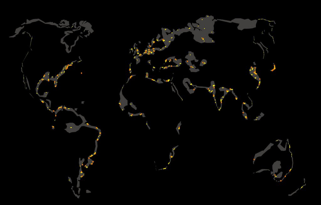
The map below illustrates areas of economic prosperity that lie within the risk areas. The yellow dots represent centers of industry such as transportation, shipping, electronics, textiles, chemicals, paper, and food processing. The orange squares represent centers of service that include tourism, finance, trade, and government. This data was taken from another map and inserted on the areas at risk.

2 comments:
i think these are very interesting and a good direction. i think another strategy for inserting new map information is to subtract from continents, so we can see how these become negative areas as well.
i'm still curious to know how you define green vs. orange in your original mappings, so i don't continue to call them green and orange. give it a name.
zooming in to one of these places would be interesting.
i also wonder if the black background is distracting, maybe making the information harder to read. also, the black rectagle suggests a boundary that doesn't really exist.
Post a Comment