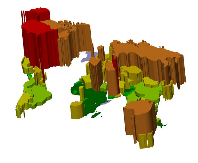
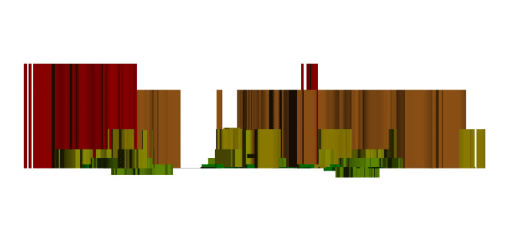
The first two images illustrate the level of carbon emissions by country using an image extraction. The second image looked at the model in elevation.
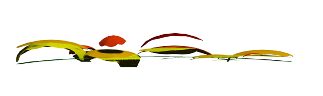
The second two images illustrate the global air temperature distribution. The mapping still lacks some clarity but I used it to begin experiementing with how the information might become 3D by manipulating the mesh as shown in the elevation below.

 The mapping that includes the sea level rise is illustrated in the previous post. I am still working out the best way to portray such information.
I am attempting to analyze these various mapping techniques and additional animation techniques in order to construct the final maptation. It is still unclear to me at this point what that might look like once the layers begin to work with one another. I have also been looking at all 2D information maps- the question now is what elements can be visually shown through animation? How do the various layers work with one another?

1 comment:
"how do the various layers work with each other?". my answer is that you will only discover this once you combine them, then it might be issues of texture, light, transprency and representation in general. i really like the clarity of the extruded countries. amazing data scape.
Post a Comment