Pretty complex stuff. Here's an idea: It may add some clarity if you separate each set of data in order of its cause and effect relationship. As in, first show the emissions datascape growing, then the warming atmosphere, then the rising sea levels, and then maybe everything at once. In other words, emphasize the cause and effect relationship by showing a series of clips rather than everything all at once. Then when everything is seen at once it could be better understood.
interesting start, jill. i think your realization of the file's complexity will start to clarify your mapping. could the extrusions start to map topography as a realization of another set of data, so that the height represents one set of data and the topography could represent another set of data??
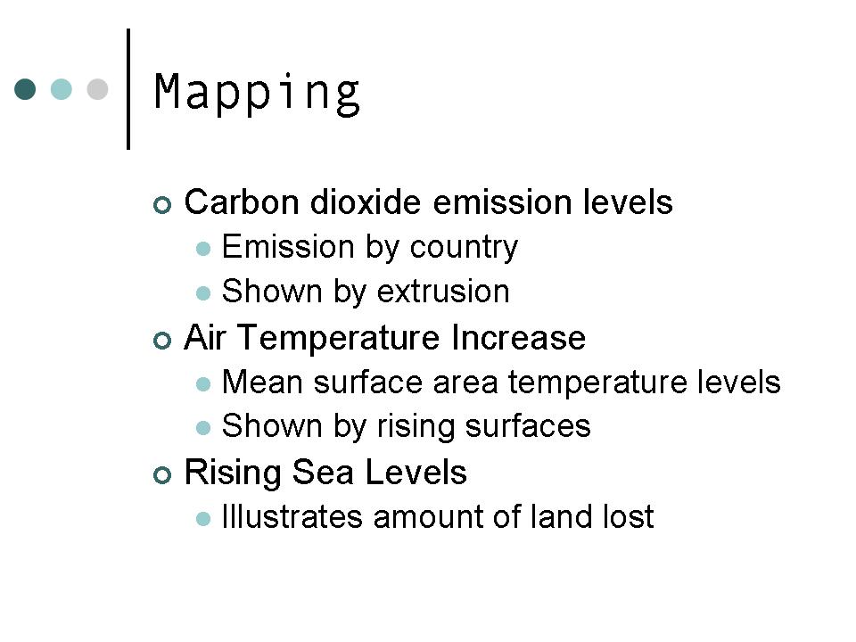
first, it think that your graphics are very sexy, especially the extruding countries.
i agree with what nate said in his post...try to separate the data so that each compnent can be understood. remember that your animation can be longer than just a few seconds.
to help, maybe try to animate seprate files. create one file where you extruded the emissions datascape growing. animate this. then take the extruded shapes into a new file, and show the warming atmosphere. animate this. you should be able to combine these two animations into one. this should simplify the process and help your computer.
I agree with nate...I think you could take a step backwards and separate the information you have now and show the animation in several clear steps. Although nice to look at it's also a little confusing.
I agree with many of the ealier stated comments. When I watch your animations its clear how much information your are trying to convey and graphically it seems like some elements are getting lost, perhaps the seperation of animations as suggested bye nate and jason will help. Also, it may help to asign a different visual "tag" to each factor you are mapping; for instance, the rising water levels and the emissions levels graphics could have distinct color schemes to make them stand out. Right now, it seems like, some your data is running together with all the colors of other data sets. A really interesting start with a lot of information though.


5 comments:
Pretty complex stuff. Here's an idea:
It may add some clarity if you separate each set of data in order of its cause and effect relationship. As in, first show the emissions datascape growing, then the warming atmosphere, then the rising sea levels, and then maybe everything at once. In other words, emphasize the cause and effect relationship by showing a series of clips rather than everything all at once. Then when everything is seen at once it could be better understood.
interesting start, jill. i think your realization of the file's complexity will start to clarify your mapping. could the extrusions start to map topography as a realization of another set of data, so that the height represents one set of data and the topography could represent another set of data??
first, it think that your graphics are very sexy, especially the extruding countries.
i agree with what nate said in his post...try to separate the data so that each compnent can be understood. remember that your animation can be longer than just a few seconds.
to help, maybe try to animate seprate files. create one file where you extruded the emissions datascape growing. animate this. then take the extruded shapes into a new file, and show the warming atmosphere. animate this. you should be able to combine these two animations into one. this should simplify the process and help your computer.
I agree with nate...I think you could take a step backwards and separate the information you have now and show the animation in several clear steps. Although nice to look at it's also a little confusing.
I agree with many of the ealier stated comments. When I watch your animations its clear how much information your are trying to convey and graphically it seems like some elements are getting lost, perhaps the seperation of animations as suggested bye nate and jason will help. Also, it may help to asign a different visual "tag" to each factor you are mapping; for instance, the rising water levels and the emissions levels graphics could have distinct color schemes to make them stand out. Right now, it seems like, some your data is running together with all the colors of other data sets. A really interesting start with a lot of information though.
Post a Comment